...
The Global Scan dashboard enables you to view the current status of all of the Elements (servers and devices, Applications, and SLAs) in your environment. When initially viewed, the Global Scan dashboard is displayed, and typically contains a list of all the Elements that are being monitored by up.time. The Elements table displays the following information:
- the status and number of services that are associated with the Element
- the number of recent service outages
- CPU usage
- hard disk usage
- memory usage
For convenience, you can sort the Elements table by any outage type.
Service status indicators range from normal (green), to Warning (yellow), to Critical (red), and also include an Unknown state (gray). An Unknown state indicates that no performance data for the last 10 minutes exists for the Element. To avoid false positives, note that recently added Elements will have this status until 10 minutes’ worth of performance data has been is collected; also, in cases where the up.time Data Collector service is down for more than 10 minutes, all Elements will have this status until the service has been is restarted and enough data has been is collected.
The thresholds for the service status indicators are typically 70% for a warning state, and 90% for a critical state. These thresholds can be customized (see Changing Reporting Thresholds).
The Recent Incidents bar chart at the top left displays, in real-time, the number of service monitors that reported a non-OK status (CRIT, WARN, UNKNOWN, MAINT) during each of the past 24 hours. Note that host rechecks are included in the incident tally.
The Current Service Status pie chart at the top right visualizes the current availability of systems or devices. The services for unmonitored systems in groups are not shown in the pie chart.
Viewing More Information
You can view detailed information about an Element by clicking its name. To view the details of each metric (for example, CPU usage) click the number in the column for that variable to go to its Graphing page, where you will be able to generate a graph.
When you click the file folder icon to the left of a system name, an expanded view of the server information appears:
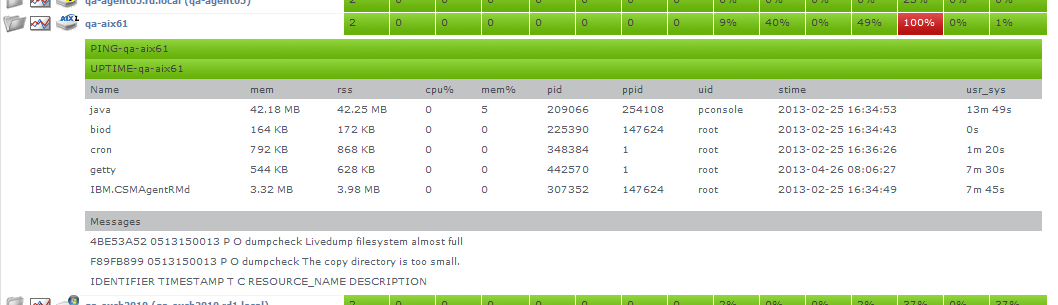
up.time displays the following information for the system in the expanded view:
- the first section displays the names of the services associated with the Element, as well as their current states
- the second section lists the top five CPU-consuming processes for the Element
- the third section displays up to five of the most recent error messages reported by the up.time agent or Windows' Service Control Manager
Groups and Views in the Global Scan Dashboard
When you create groups or views (see Working with Groups and Working with Views), they appear in their own sections in the Global Scan dashboard. The following information is displayed:
- the names and descriptions of the groups
- the number of Elements in each group
- the status of the hosts that make up the group
- the number of alerts per group
When you click a group or view in the Global Scan dashboard, the systems that make up the group or view and details about their status are displayed.
Resource Scan
Resource Scan is a dynamically-updated dashboard that reports the percentage of various resources that are being used by the servers and groups of servers in your environment. Access this dashboard by clicking the Resource Scan tab. This dashboard is comprised of several components: performance gauges, charts, and Element tables.
Performance Gauges
The row of gauges is updated every 15 minutes based on the most recently collected data:
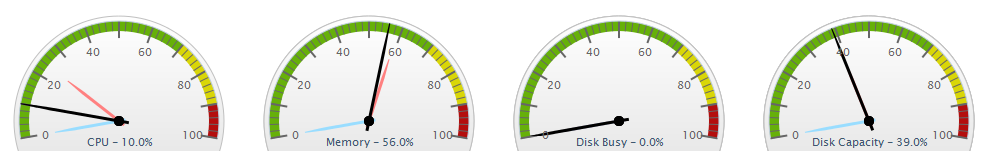
The dials display averages of the most recent 15-minute time interval, as well as the maximum and minimum values recorded over the past 24 hours up to the most recent time frame. The gauges show the following information:
- CPU Usage: the percentage of the system’s CPU resources that are being used
- Memory Usage: the amount of memory, expressed as a percentage of total available memory, being consumed by a process
- Disk Busy: the percentage of time that the disk is handling transactions in progress
- Disk Capacity: the percentage of space on the system disk that is being used
The thresholds for the service status indicators are typically 70% for a warning state, and 90% for a critical state. These thresholds can be customized (see Changing Reporting Thresholds).
Note that if data are not yet available (e.g., the Element in focus is newly added), the gauges will report as unavailable until a time interval has passed; if there are data, but no recent data (e.g., an Element is no longer down), there will be minimum and maximum dials, but no main average dial until a sample of data has been is collected.
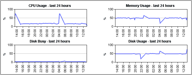
24-Hour Performance Graphs
While the gauges each display a minimum, maximum, and average value; the full 24-hour performance history is displayed in the graphs below:
Element Tables
All server-type Elements and Element Groups that make up your monitored inventory are displayed below the graphs
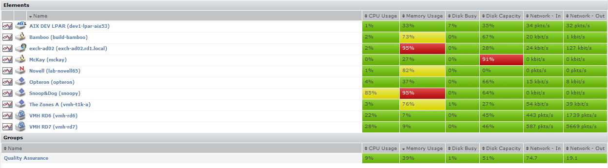
The following information is displayed in sortable columns:
- CPU Usage: the percentage of CPU resources that are being used
- Memory Usage: the amount of memory, expressed as a percentage of total available memory, that is being consumed by a process
- Disk Busy: the percentage of time the disk is handling transactions
- Disk Capacity: the percentage of storage space on the system disk that is being used
- Network In: the average amount of traffic coming in over the network interface
- Network Out: the average amount of traffic going out over the network interface
In this section of the dashboard, the servers are presented as they have been are organized in My Infrastructure. If applicable, you can click top-level Groups to display the group's servers and (if applicable) subgroups. As you click group or server names, the status reported in the gauges and charts reflects your current location in your infrastructure, whether it is parent groups, nested groups, or individual servers.
When viewing a group, you can navigate to other groups by selecting the name of the group from the Current Location dropdown list at the top of the dashboard:

Viewing All SLAs
Service level agreements on the SLAs dashboard indicate whether performance targets are being met. Although the main summary displays the status of the SLA definition as a whole, you can also expand the view to verify how well component service level objectives (SLOs) are meeting targets. (SLOs are made up of monitored services that, as a group, are used to measure a specific performance goal.)
In the Service Level Agreements subpanel (accessed by clicking the SLAs tab), the following SLA information is provided in the default view:
- the list of SLAs, and whether any are in a critical or warning-level state
- headway into the time period during which compliance is measured
- the percentage of allowable downtime used, after which the SLA’s status becomes critical
SLA Status Indicators
The color coding used in the Service Level Agreements subpanel indicates, at a glance, whether the SLAs’ respective limits are in danger of or have are already been exceeded:
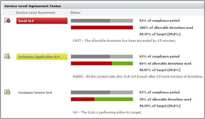
The Downtime progress bar allows you to gauge how close the SLA is to reaching a critical state:
- an SLA whose allowable downtime exceeds 100% reaches a critical state, is highlighted with red, and is accompanied by the critical state icon (
 )
)
- an SLA whose allowable downtime, at the current rate of use, will be depleted before the compliance period has ended enters a warning-level state, is highlighted with yellow, and is accompanied by the warning state icon (
 )
)
- an SLA whose graphed allowable downtime does not exceed the graphed progress through the compliance period is in a compliant state
Note that once an SLA reaches a critical state, it will remain in that state until the compliance period has restarted the following week or month; an SLA that enters a warning-level state can be downgraded to a normal state if the rate at which allowable downtime is used decreases to a “safer” value.
Generating an SLA Detailed Report
Clicking an SLA’s corresponding Detailed Report button instantly generates an SLA Detailed report for the last 24 hours.
See Reports for Service Level Agreements for more information.
SLA View Types
The Service Level Agreements subpanel provides two types of views: Condensed View and Detailed View. The latter view is suitable if you have one or two defined SLAs.
Condensed View
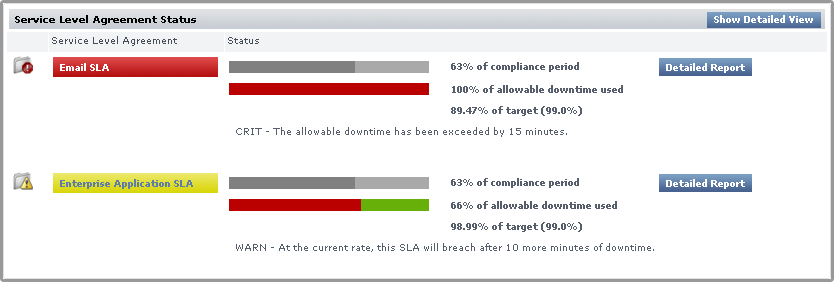
The Condensed View is the default view of this subpanel and displays the following information:
- the name of the SLA
- a status breakdown of the SLA for the current time period:
- time period elapsed
- available downtime used for the current time period
- how close the SLA is to its performance target
- status message
Detailed View
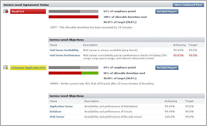
Click the Show Detailed View button to expand each SLA to include SLOs.
An SLA’s compliance is based on the downtime of its component SLOs: when one or more of the SLOs experience downtime, it counts towards overall SLA non-compliance.
Clicking an SLO name displays the status of the SLO, and all of the services that make up the SLO:
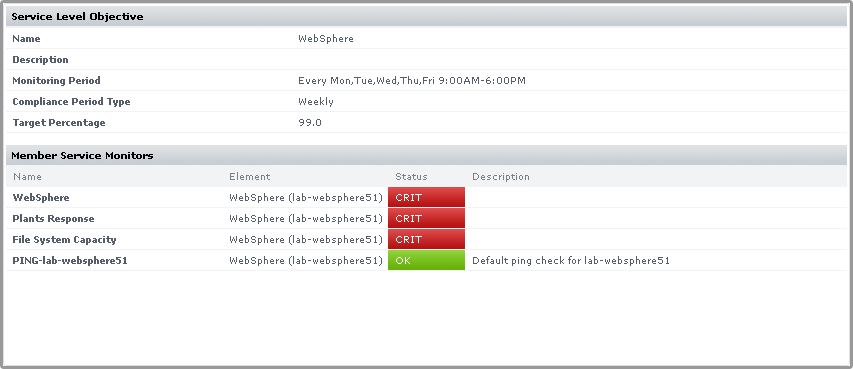
Using the Detailed View allows you to pinpoint which SLO is causing SLA non-compliance, and in turn which monitors are causing the SLO to experience downtime.
For more information about viewing SLA details, and defining SLOs that help you accurately gauge the performance of your IT infrastructure, see Working with Service Level Agreements.
...
Services are specific tasks, or sets of tasks, performed by an application in the up.time environment. up.time service monitors continually check the condition of services to ensure that they are providing the required functions to support your business. For more information on services, see Understanding Services.
You can view the services assigned to each system in your environment by clicking on the All Services tab. This tab contains the following information in sortable columns:
- the name of the service
- the Element that is associated with the service
- the status of the service
- whether an outage has been is acknowledged
- the date and time on which the last check was performed
- the number of days, hours, and minutes since the last check
- a human-readable text message that was returned by the monitor (e.g.,
up.time agent running on MailServer, up.time agent 3.7.2 linux)
| Info |
|---|
By default, services in WARN or CRIT states, or services whose associated Element is in maintenance or an undetermined state are displayed. To display all services regardless of status, unselect the Hide OK Service Monitors check box. |
Viewing Scrutinizer Status
Scrutinizer is a NetFlow analyzer that takes advantage of communications standards for Cisco IOS networking devices and other compatible switches and routers to retrieve and store network traffic information for users, systems, and applications. It allows administrators to monitor, graph, and report on network usage patterns, and locate the heaviest traffic creators.
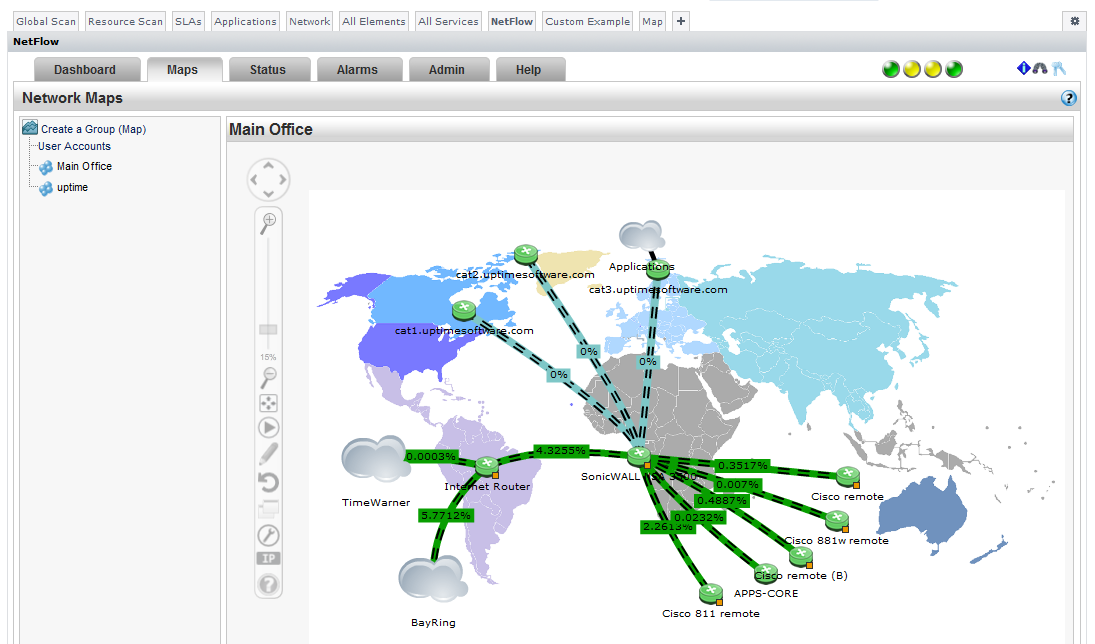
Scrutinizer can be integrated with up.time. Doing so allows you to access all of Scrutinizer’s features from the NetFlow dashboard:
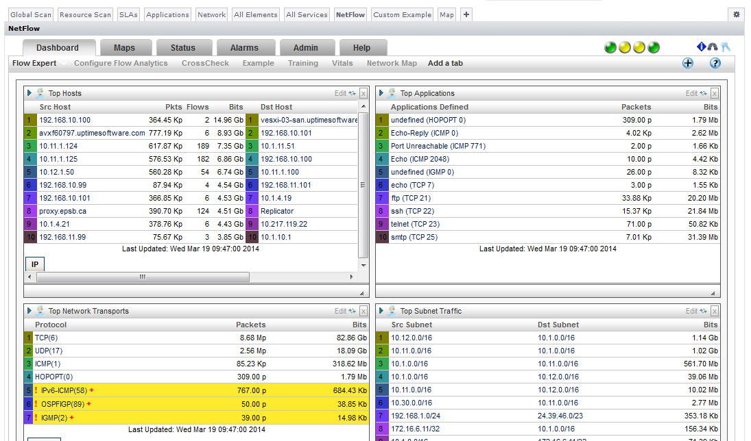
Additionally, hardware monitored by Scrutinizer that has been is added to up.time as a network-device-type Element will have a NetFlow link on its Graphing tab that transfers you to the Scrutinizer interface.
...
- INSTALL: the gadget is available on the Grid, but has is not been installed on your up.time deployment
- INSTALLED: the gadget has been is installed, and is available to be added to custom dashboards
- UPGRADE: the gadget has been is installed, but there is an update available on the Grid
...