...
The Global Scan dashboard enables you to view the current status of all of the Elements (servers and devices, Applications, and SLAs) in your environment. When initially viewed, the Global Scan dashboard is displayed, and typically contains a list of all the Elements that are monitored by Uptime Infrastructure Monitor. The Elements table displays the following information:
- the status and number of services that are associated with the Element
- the number of recent service outages
- CPU usage
- hard disk usage
- memory usage
For convenience, you can sort the Elements table by any outage type.
Service status indicators range from normal (green), to Warning (yellow), to Critical (red), and also include an Unknown state (gray). An Unknown state indicates that no performance data for the last 10 minutes exists for the Element. To avoid false positives, note that recently added Elements display this status until 10 minutes' worth of performance data is collected; also, in cases where the Uptime Infrastructure Monitor Data Collector service is down for more than 10 minutes, all Elements display this status until the service is restarted and enough data is collected.
The thresholds for the service status indicators are typically 70% for a warning state, and 90% for a critical state. These thresholds can be customized. For more information about managing reporting thresholds, see Changing Reporting Thresholds.
The Recent Incidents bar chart at the top left displays, in real-time, the number of service monitors that reported a non-OK status (CRIT, WARN, UNKNOWN, MAINT) during each of the past 24 hours. Note that host rechecks are included in the incident tally.
The Current Service Status pie chart at the top right visualizes the current availability of systems or devices. The services for unmonitored systems in groups are not shown in the pie chart.
Viewing More Information
You can view detailed information about an Element by clicking its name. To view the details of each metric (for example, CPU usage), click the number in the column for that variable to go to its Graphing page, where you can generate a graph.
When you click the file folder icon to the left of a system name, an expanded view of the server information appears:
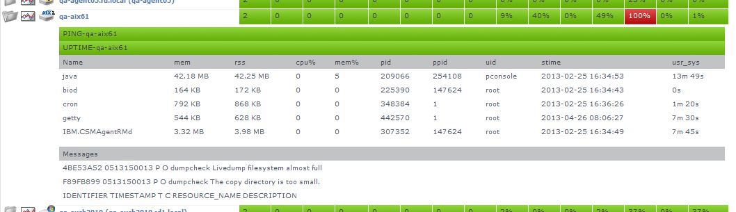
Uptime Infrastructure Monitor displays the following information for the system in the expanded view:
- the first section displays the names of the services associated with the Element, as well as their current states
- the second section lists the top five CPU-consuming processes for the Element
- the third section displays up to five of the most recent error messages reported by the Uptime Infrastructure Monitor agent or Windows' Service Control Manager
Groups and Views in the Global Scan Dashboard
When you create groups or views (see Working with Groups and Working with Views), they appear in their own sections in the Global Scan dashboard. The following information is displayed:
- the names and descriptions of the groups
- the number of Elements in each group
- the status of the hosts that make up the group
- the number of alerts per group
When you click a group or view in the Global Scan dashboard, the systems that make up the group or view and details about their status are displayed.
Resource Scan
Resource Scan is a dynamically-updated dashboard that reports the percentage of various resources that are used by the servers and groups of servers in your environment. Access this dashboard by clicking the Resource Scan tab. This dashboard is comprised of several components: performance gauges, charts, and Element tables.
Performance Gauges
The row of gauges is updated every 15 minutes based on the most recently collected data:
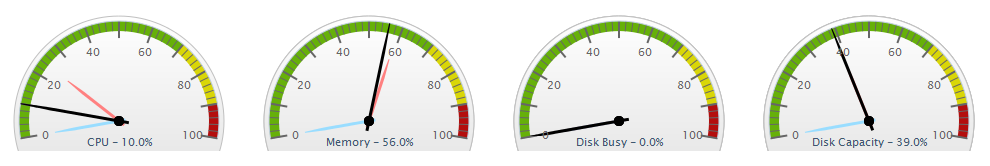
The dials display averages of the most recent 15-minute time interval, as well as the maximum and minimum values recorded over the past 24 hours up to the most recent time frame. The gauges show the following information:
- CPU Usage: the percentage of the system CPU resources that are used
- Memory Usage: the amount of memory, expressed as a percentage of total available memory, consumed by a process
- Disk Busy: the percentage of time that the disk is handling transactions in progress
- Disk Capacity: the percentage of space on the system disk that is used
The thresholds for the service status indicators are typically 70% for a warning state, and 90% for a critical state. These thresholds can be customized. For more information about customizing reporting thresholds, see Changing Reporting Thresholds.
Note that if data is not yet available (e.g., the Element in focus is newly added), the gauges report as unavailable until a time interval passes; if there is data, but no recent data (e.g., an Element is no longer down), there are minimum and maximum dials, but no main average dial until a sample of data is collected.
24-Hour Performance Graphs
While the gauges each display a minimum, maximum, and average value; the full 24-hour performance history is displayed in the graphs below:

Element Tables
All server-type Elements and Element Groups that make up your monitored inventory are displayed below the graphs
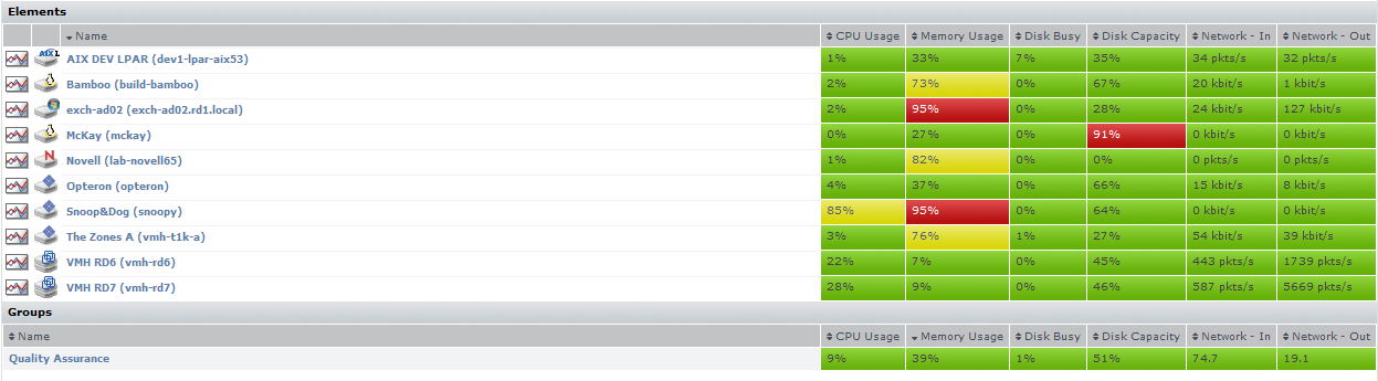
The following information is displayed in sortable columns:
- CPU Usage: the percentage of CPU resources that is used
- Memory Usage: the amount of memory, expressed as a percentage of total available memory, that is consumed by a process
- Disk Busy: the percentage of time the disk is handling transactions
- Disk Capacity: the percentage of storage space on the system disk that is used
- Network - In: the average amount of traffic coming in over the network interface
- Network - Out: the average amount of traffic going out over the network interface
In this section of the dashboard, the servers are presented as they are organized in Infrastructure. If applicable, you can click top-level Groups to display the group's servers and (if applicable) subgroups. As you click group or server names, the status reported in the gauges and charts reflects your current location in your infrastructure, whether it is parent groups, nested groups, or individual servers.
Viewing All SLAs
Service level agreements on the SLAs dashboard indicate whether performance targets are met. Although the main summary displays the status of the SLA definition as a whole, you can also expand the view to verify how well component service level objectives (SLOs) are meeting targets. (SLOs are made up of monitored services that, as a group, are used to measure a specific performance goal.)
In the Service Level Agreements subpanel (accessed by clicking the SLAs tab), the following SLA information is provided in the default view:
- the list of SLAs, and whether any are in a critical or warning-level state
- headway into the time period during which compliance is measured
- the percentage of allowable downtime used, after which the SLA status becomes critical
SLA Status Indicators
The color coding used in the Service Level Agreements subpanel indicates, at a glance, whether the SLA respective limits are in danger of or are already exceeded:
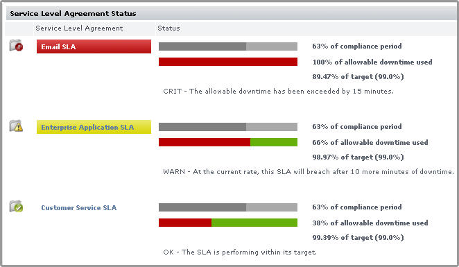
The Downtime progress bar allows you to gauge how close the SLA is to reaching a critical state:
- an SLA whose allowable downtime exceeds 100% reaches a critical state, is highlighted with red, and is accompanied by the critical state icon (
 )
)
- an SLA whose allowable downtime, at the current rate of use, is depleted before the compliance period ends enters a warning-level state, is highlighted with yellow, and is accompanied by the warning state icon (
 )
)
- an SLA whose graphed allowable downtime does not exceed the graphed progress through the compliance period is in a compliant state
Note that once an SLA reaches a critical state, it remains in that state until the compliance period restarts the following week or month; an SLA that enters a warning-level state can be downgraded to a normal state if the rate at which allowable downtime is used decreases to a “safer” value.
Generating an SLA Detailed Report
Clicking an SLA’s corresponding Detailed Report button instantly generates an SLA Detailed report for the last 24 hours. For more information about SLA reporting, see Reports for Service Level Agreements.
SLA View Types
The Service Level Agreements subpanel provides two types of views: Condensed View and Detailed View. The latter view is suitable if you have one or two defined SLAs.
Condensed View
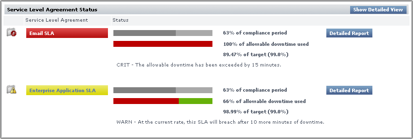
The Condensed View is the default view of this subpanel and displays the following information:
- the name of the SLA
- a status breakdown of the SLA for the current time period:
- time period elapsed
- available downtime used for the current time period
- how close the SLA is to its performance target
- status message
Detailed View
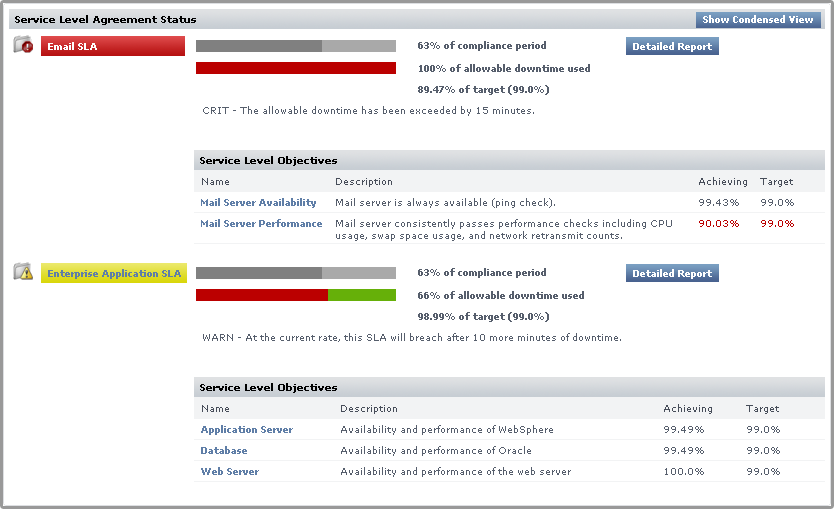
Click the Show Detailed View button to expand each SLA to include SLOs.
An SLA’s compliance is based on the downtime of its component SLOs: when one or more of the SLOs experience downtime, it counts towards overall SLA non-compliance.
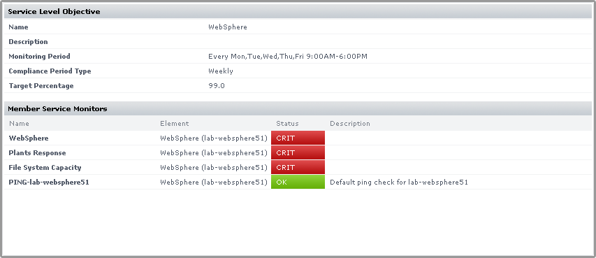
Clicking an SLO name displays the status of the SLO, and all of the services that make up the SLO:
Using the Detailed View allows you to pinpoint which SLO is causing SLA non-compliance, and in turn which monitors are causing the SLO to experience downtime.
For more information about viewing SLA details, and defining SLOs that help you accurately gauge the performance of your IT infrastructure, see Working with Service Level Agreements.
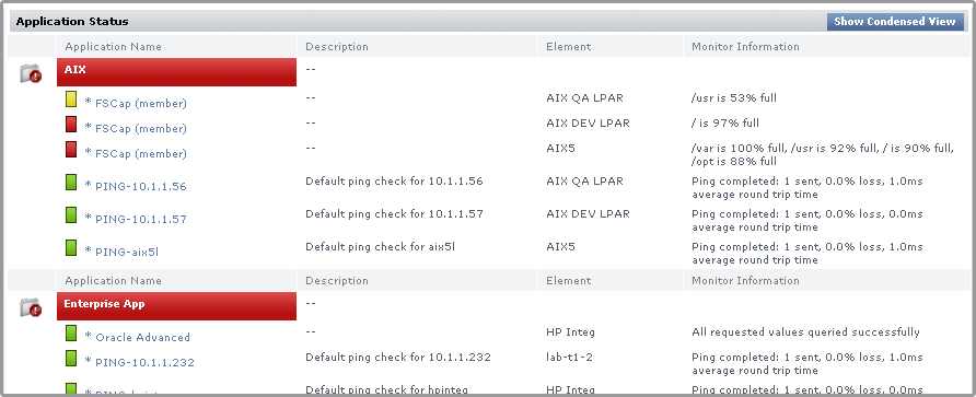
Viewing All Applications
The Applications dashboard displays the status of all Applications that the currently logged in user is permitted to view. Applications are groups of service monitors that together represent the status of a greater business or IT function within your organization. They consist of any number of two types of monitors:
- master service monitor: used to determine the status of the Application as a whole
- regular service monitor: does not affect Application status, but helps provide a complete picture by representing a secondary service, or a direct dependency of a master service
On the dashboard, the overall status of each Application is color coded:
- Applications functioning normally are marked with a check box icon (
 )
) - Applications undergoing maintenance are marked with a scheduled maintenance icon (
 )
) - Applications in a warning state are highlighted in yellow and marked with a warning icon
- Applications in a critical state are highlighted in red and marked with a critical icon
The number and status of an Application's service monitors are also displayed through a series of bars: green indicates the service is functioning normally; yellow means the service is in a warning state; and red indicates the service is in a critical state. This information can be displayed in a default Condensed View, or a Detailed View.
Condensed View
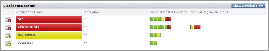
The Condensed view is the default view for the dashboard and displays the following information:
- the name of the Application
- a description of the Application
- the status of each service in the Application
The status of the service is denoted by a colored bar in the Status of Master Services and Status of Regular Services columns. For example, if there are three services associated with the Application and their status is OK then three green bars appear in this column.
Detailed View
Click the Show Detailed View button to change to a detailed view of the dashboard.
In this view, more information is provided for each of an Application's component service monitors, including the monitor's most current status message. Service monitor names can be clicked, taking you to the service status page for the host to which it is attached.
Master service monitors in an Application are marked with an asterisk (*). The status of a service is denoted by a colored bar beside the name of the service.
Viewing the Network Dashboard
The network dashboard is a summary of network device performance, and network-based service monitor outages. It is automatically updated every 30 seconds. You can view this dashboard by clicking the Network tab.
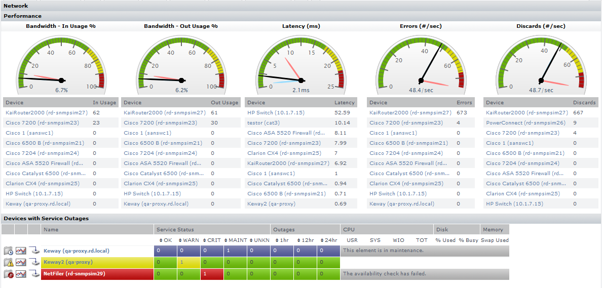
The network dashboard provides you with a single view of your network environment, and keeps you abreast of any network-related issues:
- instantly spot network capacity issues, and compare trends over the past day
- pinpoint top resource consumers to help resolve performance bottlenecks before they cause an outage
- immediately spot network devices that are currently failing, and click through to investigate the root cause
The following metrics are together used to report network performance:
In Usage | global inbound bandwidth usage of all monitored network devices’ ports | |
Out Usage | global outbound bandwidth usage of all monitored network devices’ ports | |
Latency | network device latency values collected through each monitored Element’s ping monitor does not include network devices without an assigned ping monitor | |
Errors | the average number of errors per second through all monitored network device ports | |
Discards | the average number of packets discarded per second through all monitored network device ports | |
For each category, there is a performance gauge that displays the average for all monitored ports based on the most recent sample. Maximum and minimum values over the last 24 hours is also shown. Note that the first two metrics are percentage-based, and their gauges are static; the remaining three metrics' gauges may scale if the recorded value exceeds the default upper limit. The thresholds for the service status indicators are typically 70% for a warning state, and 90% for a critical state.
Additionally for each category, there are top-10 lists displaying the individual Elements that are using the most bandwidth, have the highest latency, or seeing the most errors or discarded packets. Clicking any Element name displays its Quick Snapshot page, where you can further investigate bottlenecks.
Devices with Service Outages
Any network device Element whose attached service monitors are experiencing outages are displayed in this section. For convenience, you can sort the results by number of current outages, or outage occurrences.
| Info |
|---|
If the dashboard is viewed by an Uptime Infrastructure Monitor user who does not have permission to view all Elements, and as a result, may not be able to see network device Elements, the list is empty, and Uptime Infrastructure Monitor reports that there are no available network devices. |
Viewing All Elements
Elements are the systems, network devices, Applications, and SLAs that Uptime Infrastructure Monitor is currently monitoring. You can view the status of all monitored Elements on the All Elements dashboard. This can be accessed by clicking the All Elements tab.
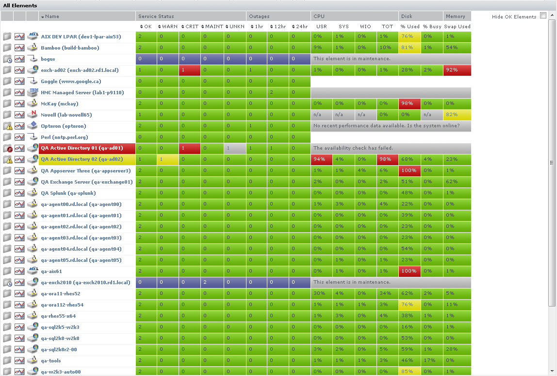
The Elements subpanel lists the following information:
- the names of the Elements in your environment
- the status of the services that are assigned to each Element
- the number of outages over the last hour, 12 hours, and 24 hours
- the percentage of CPU resources consumed by users, the system, and by disk I/O
- the percentage of the system disk that is used and the percentage that is busy
- the amount of memory swap space that is used
For convenience, you can sort the Elements table by any outage type.
If Uptime Infrastructure Monitor cannot contact an Element, the reason is displayed:
- The availability check has failed.
- This element is in maintenance.
- This VM is currently powered off.
The values in each column are hyperlinks. Click one of the links to display the following information in the system information or graphing subpanels:
- Click any value in the OK, WARN, CRIT, MAINT, or UNKNOWN columns to open the Element's Status subpanel.
- Click any value in the Outages column to open the Element's Outages subpanel.
- Click any value in the USR, SYS, WIO, or TOT columns to open the Element's Usage% Busy report subpanel. For more information about the Usage report, see Usage (% busy) for more information.
- Click any value in the % Used column to open the Element's File System Capacity report subpanel. For more information about graphing the file system capacity, see File System Capacity Graph.
- Click any value in the % Busy column to open the Element's Disk Performance Statistics report subpanel. For more information about graphing the disk performance statistics, see Disk Performance Statistics Graph.
| Info |
|---|
By default, Elements in WARN or CRIT states, in maintenance, or whose status is undetermined are displayed. To display all Elements regardless of status, clear the Hide OK Elements check box. |
...
Viewing Scrutinizer Status
Scrutinizer is a NetFlow analyzer and incident response system that takes advantage of communications standards, i.e. NetFlow and IPFIX for Cisco as well as other compatible switches and routers. It does this to retrieve and store network traffic information for users, systems, and applications. Scrutinizer allows administrators to monitor, graph, and report on network usage patterns, and locate the heaviest traffic creators.
Scrutinizer can be integrated with Uptime Infrastructure Monitor. Doing so allows you to access all of Scrutinizer's features from the NetFlow dashboard:
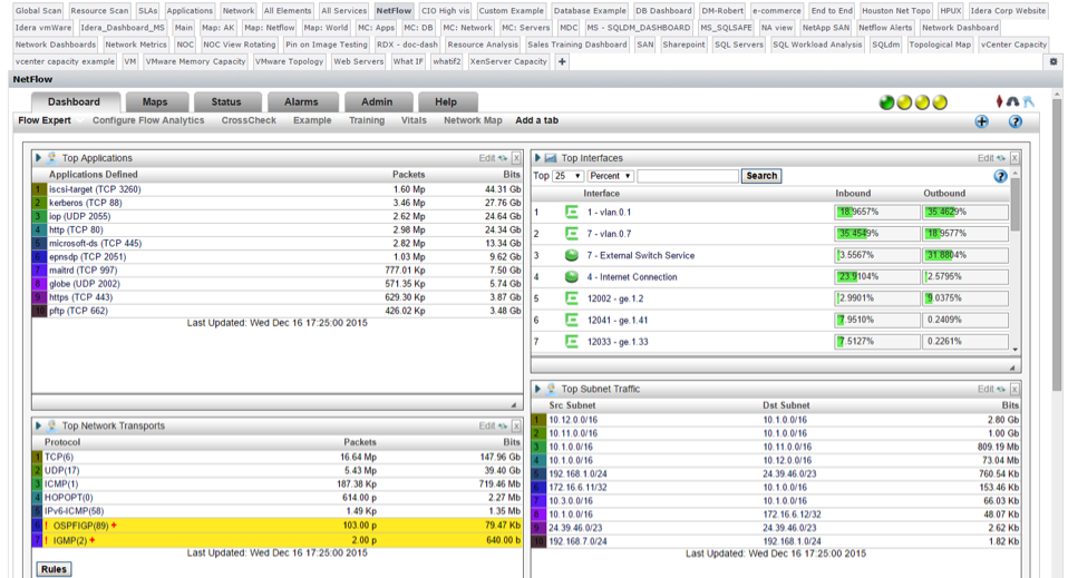
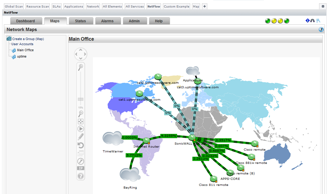
Additionally, hardware monitored by Scrutinizer that is added to Uptime Infrastructure Monitor as a network-device-type Element includes a NetFlow link on its Graphing tab that transfers you to the Scrutinizer interface. For more information about integrating Uptime Scrutinizer, see Integrating Scrutinizer with Uptime Infrastructure Monitor.
...
Dashboards are based on one of various layouts, then completed by configuring component gadgets:
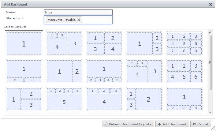
Gadgets, after developed, interface with Uptime Infrastructure Monitor using the Uptime Infrastructure Monitor Controller. Refer to the Integration Guide for more information.
...
For information about each gadget, see Dashboard Gadgets.