...
The Global Scan dashboard enables you to view the current status of all of the Elements (servers and devices, Applications, and SLAs) in your environment. When initially viewed, the Global Scan dashboard is displayed, and typically contains a list of all the Elements that are monitored by Uptime Infrastructure Monitor. The Elements table displays the following information:
- the status and number of services that are associated with the Element
- the number of recent service outages
- CPU usage
- hard disk usage
- memory usage
For convenience, you can sort the Elements table by any outage type.
Service status indicators range from normal (green), to Warning (yellow), to Critical (red), and also include an Unknown state (gray). An Unknown state indicates that no performance data for the last 10 minutes exists for the Element. To avoid false positives, note that recently added Elements display this status until 10 minutes' worth of performance data is collected; also, in cases where the Uptime Infrastructure Monitor Data Collector service is down for more than 10 minutes, all Elements display this status until the service is restarted and enough data is collected.
The thresholds for the service status indicators are typically 70% for a warning state, and 90% for a critical state. These thresholds can be customized. For more information about managing reporting thresholds, see Changing Reporting Thresholds.
The Recent Incidents bar chart at the top left displays, in real-time, the number of service monitors that reported a non-OK status (CRIT, WARN, UNKNOWN, MAINT) during each of the past 24 hours. Note that host rechecks are included in the incident tally.
The Current Service Status pie chart at the top right visualizes the current availability of systems or devices. The services for unmonitored systems in groups are not shown in the pie chart.
Viewing More Information
You can view detailed information about an Element by clicking its name. To view the details of each metric (for example, CPU usage), click the number in the column for that variable to go to its Graphing page, where you can generate a graph.
When you click the file folder icon to the left of a system name, an expanded view of the server information appears:
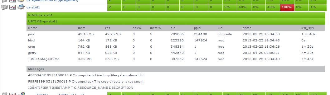
Uptime Infrastructure Monitor displays the following information for the system in the expanded view:
- the first section displays the names of the services associated with the Element, as well as their current states
- the second section lists the top five CPU-consuming processes for the Element
- the third section displays up to five of the most recent error messages reported by the Uptime Infrastructure Monitor agent or Windows' Service Control Manager
Groups and Views in the Global Scan Dashboard
When you create groups or views (see Working with Groups and Working with Views), they appear in their own sections in the Global Scan dashboard. The following information is displayed:
- the names and descriptions of the groups
- the number of Elements in each group
- the status of the hosts that make up the group
- the number of alerts per group
When you click a group or view in the Global Scan dashboard, the systems that make up the group or view and details about their status are displayed.
Resource Scan
Resource Scan is a dynamically-updated dashboard that reports the percentage of various resources that are used by the servers and groups of servers in your environment. Access this dashboard by clicking the Resource Scan tab. This dashboard is comprised of several components: performance gauges, charts, and Element tables.
Performance Gauges
The row of gauges is updated every 15 minutes based on the most recently collected data:
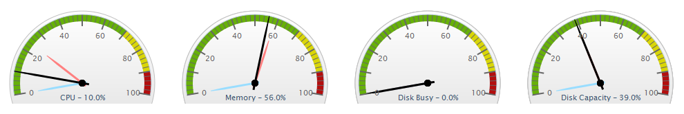
The dials display averages of the most recent 15-minute time interval, as well as the maximum and minimum values recorded over the past 24 hours up to the most recent time frame. The gauges show the following information:
- CPU Usage: the percentage of the system CPU resources that are used
- Memory Usage: the amount of memory, expressed as a percentage of total available memory, consumed by a process
- Disk Busy: the percentage of time that the disk is handling transactions in progress
- Disk Capacity: the percentage of space on the system disk that is used
The thresholds for the service status indicators are typically 70% for a warning state, and 90% for a critical state. These thresholds can be customized. For more information about customizing reporting thresholds, see Changing Reporting Thresholds.
Note that if data is not yet available (e.g., the Element in focus is newly added), the gauges report as unavailable until a time interval passes; if there is data, but no recent data (e.g., an Element is no longer down), there are minimum and maximum dials, but no main average dial until a sample of data is collected.
24-Hour Performance Graphs
While the gauges each display a minimum, maximum, and average value; the full 24-hour performance history is displayed in the graphs below:

Element Tables
All server-type Elements and Element Groups that make up your monitored inventory are displayed below the graphs
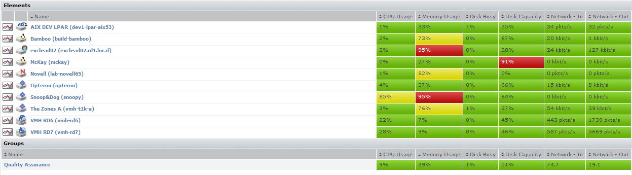
The following information is displayed in sortable columns:
- CPU Usage: the percentage of CPU resources that is used
- Memory Usage: the amount of memory, expressed as a percentage of total available memory, that is consumed by a process
- Disk Busy: the percentage of time the disk is handling transactions
- Disk Capacity: the percentage of storage space on the system disk that is used
- Network In: the average amount of traffic coming in over the network interface
- Network Out: the average amount of traffic going out over the network interface
In this section of the dashboard, the servers are presented as they are organized in My Infrastructure. If applicable, you can click top-level Groups to display the group's servers and (if applicable) subgroups. As you click group or server names, the status reported in the gauges and charts reflects your current location in your infrastructure, whether it is parent groups, nested groups, or individual servers.
When viewing a group, you can navigate to other groups by selecting the name of the group from the Current Location dropdown list at the top of the dashboard:

...
For information about each gadget, see Dashboard Gadgets.