...
Viewing the Status of a System
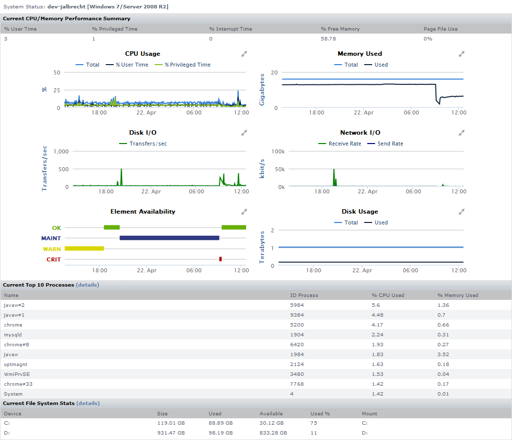
You can view the status of a system in your environment using a Quick Snapshot. The Quick Snapshot summarizes key hardware and process information for a system for the last 24 hours. If there is not 24 hours worth of data available, then Uptime Infrastructure Monitor uses data from as far back as possible to generate charts.
The Quick Snapshot is typically used as a preliminary step toward root cause analysis. When you first acknowledge an issue by clicking an Element name on either the Global Scan dashboard, or the My Alerts section of My Portal, you are shown the Quick Snapshot for that Element. From here, you can work with the information provided in the charts and tables and begin further investigation:
- clicking the expand arrow at the top-right of a chart enlarges it
- in the enlarged chart, click-dragging a start and end point along the timeline expands that specific range
- when viewing an enlarged chart, you print or export it by clicking the context menu icon at the top-right, then making the appropriate choice
- at any zoom range, hovering the mouse pointer along the timeline displays the value for that precise interval
- when more than one metric is displayed, clicking metrics in the legend toggles them on and off, allowing you to focus on a specific metric
The Quick Snapshot contains the following information:
System Status Charts | Top 10 Processes | File System Statistics |
|---|---|---|
|
|
|
| Info |
|---|
The components that comprise a Quick Snapshot depend on the type of Element in view. Monitored Elements typically provide the aforementioned information. For information about Quick Snapshots for VMware vSphere objects, or a network device, see Viewing the Status of a vSphere Element, and Viewing the Status of a Network Device, respectively. |
Viewing a Quick Snapshot
On the Global Scan dashboard, click the name of the system whose information you want to graph. The Quick Snapshot is displayed by default.
Generally speaking, you can access a Quick Snapshot for an Element by clicking the Graphing tab, then clicking Quick Snapshot in the Tree panel.
...
Viewing the Status of a Network Device
The Quick Snapshot for a network device summarizes both the recent (24-hour) and current performance of SNMP-based devices, and can help administrators identify potential issues.
| Info |
|---|
If there are not 24 hours’ worth of data available, Uptime Infrastructure Monitor uses data from as far back as possible to generate charts. |
The Quick Snapshot is typically used as a preliminary step toward root-cause analysis. When you first acknowledge an issue by clicking the network device’s Element name in either Global Scan or the My Alerts section of My Portal, you are shown its Quick Snapshot. From here, you can work with the information provided in the charts and tables (e.g., overloaded ports, or excessively long round-trip times) and begin further investigation:
- clicking the expand arrow at the top-right of a chart enlarges it
- in the enlarged chart, click-dragging a start and end point along the timeline expands that specific range
- when viewing an enlarged chart, you print or export it by clicking the context menu icon at the top-right, then making the appropriate choice
- at any zoom range, hovering the mouse pointer along the timeline displays the value for that precise interval
- when more than one metric is displayed, clicking metrics in the legend toggles them on and off, allowing you to focus on a specific metric
Network Device Quick Snapshot Contents
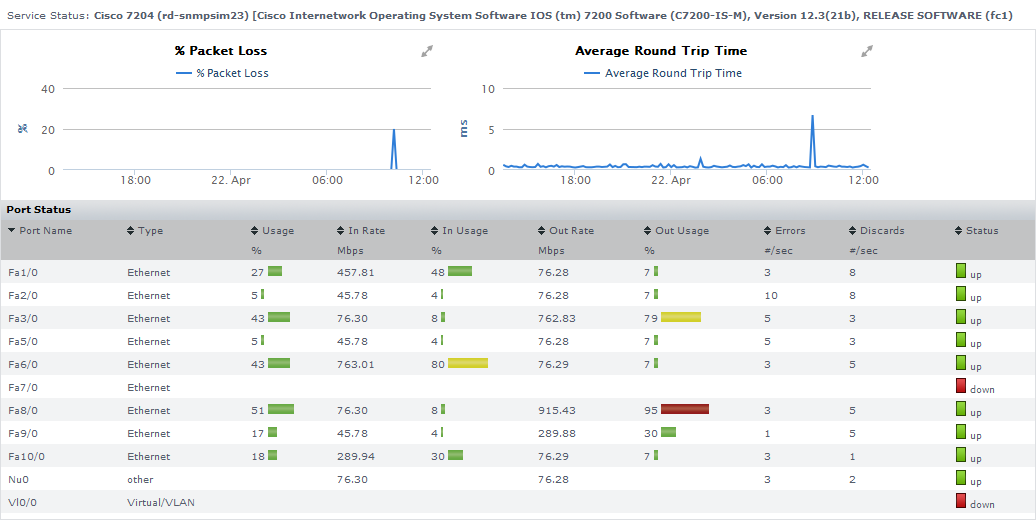
The following information is displayed in a network device’s Quick Snapshot.
Performance Charts | ||
% Packet Loss |
| |
Average Round-Trip Time |
| |
Port Status | ||
Port Name | the name of the port on the network device | |
Port Type | the interface type (i.e., Ethernet or Virtual/VLAN) | |
Usage | the percentage of the port’s maximum throughput that was used during the most recent time interval | |
In Rate | the average throughput of inbound packets, in Mbps, during the most recent time interval | |
In Usage | the percentage of the port’s maximum throughput that was used by inbound packets during the most recent time interval | |
Out Rate | the average throughput of outbound packets, in Mbps, during the most recent time interval | |
Out Usage | the percentage of the port’s maximum throughput that was used by outbound packets, during the most recent time interval | |
Errors | the average number of errors per second, during the most recent time interval | |
Discards | the average number of packets discarded per second, during most recent the time interval | |
Status | the current status of the port, based on information retrieved from the network device’s Platform Performance Gatherer service | |
Viewing a Quick Snapshot for a Network Device
To display the Quick Snapshot page for a network device Element, do the following:
- In the Infrastructure panel, locate the network device whose Quick Snapshot you would like to view.
- Click the gear icon beside the Element.
- In the Element’s Configure pop-menu, click Graph Performance.
| Info |
|---|
Note that when you are viewing a network device Element’s profile, you can always access its Quick Snapshot by clicking the Graphing tab, then clicking Quick Snapshot in the tree panel. |
...
Disk Performance Statistics Graph
The Disk Performance Statistics graph charts a set of disk performance metrics returned by utilities - such as perfmon on Windows, and iostat or sar on Solaris - that are running on a system.
Requests can experience delays proportional to the length of the request queue minus the number of spindles on the disks. For optimal performance, this difference should be less than two on average.
Generating a Disk Performance Statistics Graph
To generate a Disk Performance Statistics graph, do the following:
- On the Global Scan dashboard or Infrastructure panel, click the name of the system whose information you want to graph.
- In the tree panel, click the Graphing tab.
- Click Disk Performance Statistics.
- Select the start and end dates and times for which the graph charts data. For more information, see Understanding Dates and Times
- Select one of the following options:
Percent Busy
The percentage of the disk capacity used.Info For NFS systems, 100% busy does not indicate that the server itself is saturated, but that the client always has outstanding requests to that server. - Average Queue
The average number of processes that are waiting to access the disk.
The length of the queue is affected by how busy the system is and the amount of time that each transaction requires to perform a disk operation. A complete transaction must occur before the next transaction can start. Longer disk operations per transaction increases the average length of the queue. - Read/Writes
The number of read/write requests, per second, from or to a disk. - Throughput (blks/s)
The amount of disk traffic, in blocks of 512 bytes, that is flowing to and from a disk each second. - Average Wait Time
The average time, in milliseconds, that a transaction is waiting in a queue. The wait time is directly proportional to the length of the queue. - Average Serve Time
The average time, in milliseconds, required to perform a task. - All of the above for one disk
Uptime Infrastructure Monitor graphs all of the metrics listed above for a single disk.
- Select the disks for which you want to collect information from the list.
If you select multiple disks and selected All of the above for one disk in step 5, then Uptime Infrastructure Monitor only graphs information for the first disk that you selected. - Click Generate Graph.
Top 10 Disks Graph
The Top 10 Disks graph displays the ten busiest disks in your environment as of the last sample that Uptime Infrastructure Monitor has taken. If there are fewer than ten disks on the system, then all of the disks on a system charted in the graph.
Generating a Top 10 Disks Graph
To generate a Top 10 Disks graph, do the following:
- On the Global Scan dashboard or Infrastructure panel, click the name of the system whose information you want to graph.
- In the tree panel, click the Graphing tab.
- Click Top 10 Disks.
- Select the start and end dates and times for which the graph charts data. For more information, see Understanding Dates and Times
- Select one of the following options:
Percent Busy
The percentage of the disk capacity used.Info For NFS systems, 100% busy does not indicate that the server itself is saturated, but that the client has outstanding requests to that server. - Average Queue
The average number of processes that are waiting to access the disk.
The length of the queue is affected by the amount of time that each transaction requires to perform a disk operation. For both sequential and random disk transactions, a complete transaction must occur before the next transaction can begin. Longer disk operations per transactions increase the average length of the queue. - Read/Writes
The number of read/write requests per second from or to a disk. - Throughput (blks/s)
The amount of traffic, in 512 byte blocks, that is flowing to and from a disk. - Average Wait Time
The average time, in milliseconds, that a transaction is waiting in a queue. The wait time is directly proportional to the length of the queue. - Average Serve Time
The average time, in milliseconds, required to perform a task.
- Click Generate Graph.
...
Displaying Detailed Process Information
Detailed process information provides an insight into how various user and system processes are consuming system resources. The information is not presented in a graph but it is a table that contains the following information:
- Process
The name of the process, which is taken from its executed path name. - PID
The number that identifies the process. - PPID
The number that identifies the parent process. The PPID can help identify possible relationships between processes.
On Windows systems, the PPID is called the Creating Process ID. - UID
The ID of the user or account that is consuming CPU time.
On Windows systems, the UID is called the Owner. - GID
The ID of the group that is consuming CPU time.
On Windows systems, the GID is called the Group Name. - Memory Used
The amount of memory, expresses as a percentage of total available memory, consumed by a process.
On Windows systems, Memory Used is called Virtual Bytes .
The Memory Used value can be misleading because shared memory between processes is counted multiple times. For example, if five Oracle processes are using 10% of available memory, this does not indicate that Oracle is consuming 50% of system memory. - RSS
Run Set Size - the amount of physical memory used.
On Windows systems, RSS is called the Working Set. - CPU %
The percentage of the CPU time used by the process, calculated by dividing total used CPU Time by the process’ running time; if applicable, the result is further divided by the number of CPUs for the Element on which the process is running.
On Windows systems, the CPU % is called % Processor Time. - User Time
The amount of time (in seconds) that a particular user, group, or account is using the CPU.
This value is not displayed for Windows systems. User System Time
The amount of time (in seconds) that a process is consuming system time on the CPU.
This value is not displayed for Windows systems.Info You can get a better indication of the amount of work a process has done by dividing this amount by a sample of time - for example, five minutes.
Start Time
The time at which the process started. This can be used to determine the lifetime of a process.Info The process information for the current date and time is displayed in the Graphing subpanel.
Generating Detailed Process Information
To display detailed process information, do the following:
- On the Global Scan dashboard or Infrastructure panel, click the name of the system whose information you want to graph.
- In the tree panel, click the Graphing tab.
- Click Detailed Process Information.
- Select the start and end dates and times for which the graph charts data. For more information, see Understanding Dates and Times.
- Click Display Process Information.
A window containing a chart that lists the process information for the time period that you specified appears.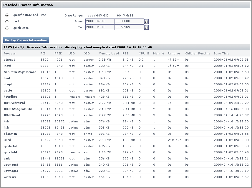
- From the dropdown list, select the date and time for which you want to view process information.
The percentage of time that the CPU spends executing Windows kernel commands. If this metric is consistently high you should consider using a faster or more efficient disk subsystem.